Best Restaurant Interior Design Ideas
Restaurant designs, restaurant interiors, best restaurant and cafe ideas
Cafe Gratitude, Los Angeles, CA
The design for Cafe Gratitude’s (Los Angeles, CA) 75-seat location—known for its organic, local menu—features both patio and interior dining, bar and retail space offering Cafe’s packaged goods. The design brings together the hand-crafted ethos of the cafe interior with the contemporary edges of the renovated Larchmont Boulevard building.
Design: Rios Clementi Hale Studios
>
California,
Los Angeles,
USA
CUT steakhouse, Beverly Hills, Los Angeles, California
The CUT steakhouse is located in Beverly Wilshire Hotel, Beverly Hills, Los Angeles, California. The restaurant plan features are semicircular geometry and generous use of sunlight. A dramatic skylight at the dining room includes semitransparent glass panels suspended below to reflect and diffuse daylight onto the ceiling and into the space. The steakhouse was awarded the AIA Restaurant Design Award in 2006.
Design: Richard Meier + Partners Architects
Interactive menu restaurant, London, UK
The Inamo interactive menu restaurant’s unique feature is menu projected from ceiling onto tabletops, allowing visitors to change the ambience of their table, to order beverages and food interactively, to order up local services and information, such as booking a cab and even to play games. When diners sit down there are an individual visual pattern for each table and round white spots for plates. Visitors use a touch panel to change their tabletop and order drink or food.
Design: Blacksheep
Patina Restaurant, Los Angeles, California
Patina Restaurant is located in the Walt Disney Concert Hall in Los Angeles. Contoured surface ceiling in the dining area radiates the warm glow of light spreading through the interior space and outward past the transparent glass facade. The restaurant has several awards for excellence in restaurant design including 2005 AIA Restaurant Design Award.
Design: Hagy Belzberg/Belzberg Architects
>
California,
Los Angeles,
USA
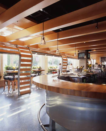
Cafe R & D, Newport Beach, California, USA
The Cafe R & D (Newport Beach, California, USA) is a 4,000 sq. ft. prototype restaurant for Houston's, Inc. The cafe is situated in Fashion Island. In addressing the issue of how to design a restaurant space within an another space, the solution blurs the boundaries between exterior and interior, transparent and solid. The curved glass and wood roll-up doors in the arcade that stretch along the facade of the restaurant redefine the transition between the outdoors and the structure envelope. With the erosion and mixing of materials, varying opacities and levels of transparencies, and a rhythm of voids and solids, the architecture design creates rich complexities as these layers overlap within the cafe, ultimately enhancing the overall dining experience. The Cafe R & D is a winner of AIA 2005 Restaurant Design Awards program.
Design: Lorcan O’Herlihy Architects
Photography: Art Cray
Ator Restaurant, Tehran, Iran
Ator Restaurant (Tehran, Iran) was designed by Expose Architecture in 2010. The area of the restaurant is 50 square meters, the chairs and tables have no legs, allowing easy and simple floor cleaning.
Design: Expose Architecture
Cupcake shop, Melbourne, Australia
Handmade tiles and soft colours in the cupcake shop (Melbourne, Australia) evokes memories of a “home” style kitchen providing an organic feeling space to the cupcake shop; cupcakes are made using only natural ingredients. Custom pieces were designed to enforce the Joy Cupcakes brand and the product: tables and stools, pendant light fittings, custom benchtop and timber peg rails.
Design: Mim Design
Photography: Shannon McGrath
Cafe Kureon, Toyama, Japan
The idea was to create a building with a fluid and organic space with light and small materials. The element the designers chose was an affordable and ordinary rectangular 105mm timber. The construction can be easily disassembled and assembled at new location if you want to move the restaurant.
Design: Kengo Kuma and Associates
Tori Tori Japanese Restaurant, Mexico City
Maintaining a very subtle and intimate feel towards the first encounter with the Tori Tori Japanese Restaurant (Mexico City), after entering you’ll find yourself in a terrace, embraced by natural vegetation. The restaurant’s landscape and facade were designed to become an organic extension of the building creating a strong relationship between the outside and the inside.
Design: Rojkind Arquitectos and Esrawe Studio
Photography: Paul Rivera
Smokehouse Room restaurant, New Delhi, India
The Smokehouse Room restaurant designers tried to create an organically growing, psychedelic, fluid landscape that melts into various parts. Designers created a quiet, understated, elegant atmosphere as a dramatic stage for a great sensorial food performance, with organic subtle undertones.
Design: Busride Design Studio
Chiringuito Pez Vela restaurant, Barcelona, Spain
The Chiringuito Pez Vela restaurant in Barcelona was designed by Spanish architectural firm Sandra Tarruella and opened in 2011.
Design: Sandra Tarruella Studio
Photography: Jordi Sarra
Modern restaurant P.S., Beijing, China
Golucci International has designed this visually stunning modern restaurant in Beijing. The interior design is intended to emphasize the "Fresh is best" policy of the restaurant.
Design: Golucci International
Photography: Sun Xiangyu
Fabbrica restaurant, Bergen
Tjep studio designed several interior elements for Fabbrica restaurant, located in Bergen, the Netherlands: cozy train cabins, pizza oven covered with Bisazza beautiful tiles and wall wood containers.
Design: Tjep
Coffee shop, Chicago
Cozy and warm Caffe Streets coffee shop (Chicago) provides a memorable experience for its visitors through standard of customer service, culinary and aesthetic excellence.
Design: Norsman Architects
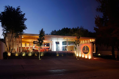
La Grelha Restaurant, Jalisco, Mexico
La Grelha Restaurant design (Jalisco, Mexico) is determined by Guadalajara perfect climat and barbecue gastronomic concept. So terrace with a hidden window for short time rains is ideal for this combination.
Design: Hernandez Silva
Ice Cream and Yogurt Leggenda Restaurant, Israel
Designers of the Ice Cream and Yogurt Leggenda Restaurant (Israel) create a space with calm and airy feeling, as desired by the customer. Pine wood element camouflages the old foundations of the building and serves as sitting bar.
Design: SO Architecture
Photography: Asaf Oren
>
Israel
Jing Chinese restaurant, Singapore
The Jing Chinese restaurant (Singapore) is placed in a 3400 sqft. unit in One Fullerton building with a south east picturesque view of the Marina Bay. It is subdivided into two activity areas: 2400 sqft. dining area (two private dining rooms, main hall, ladies powder room) and 1000 sqft back-of-house area (staff room, kitchen and office). The ceiling shape of the dining area is a dramatic expression of the interior and at the same time is a design response to a technical requirements for air conditioning system and mechanical ventilation.
Design: Antonio Eraso Co.
Photography: Derek Swalwell
Conduit restaurant, San Francisco
Conduit restaurant (San Francisco) located on the low ceiling ground floor in a residential building had a tangled maze of electrical, sprinkler and plumbing conduits serving the living accommodations above. Instead of use covering these pipes and thus reducing the space, even more pipes were layered over the existing conduits to remediate the situation.
Design: Natoma Architects, Stanley Saitowitz
Photography: Rien van Rijthoven
>
San Francisco,
USA
Subscribe to:
Comments (Atom)


